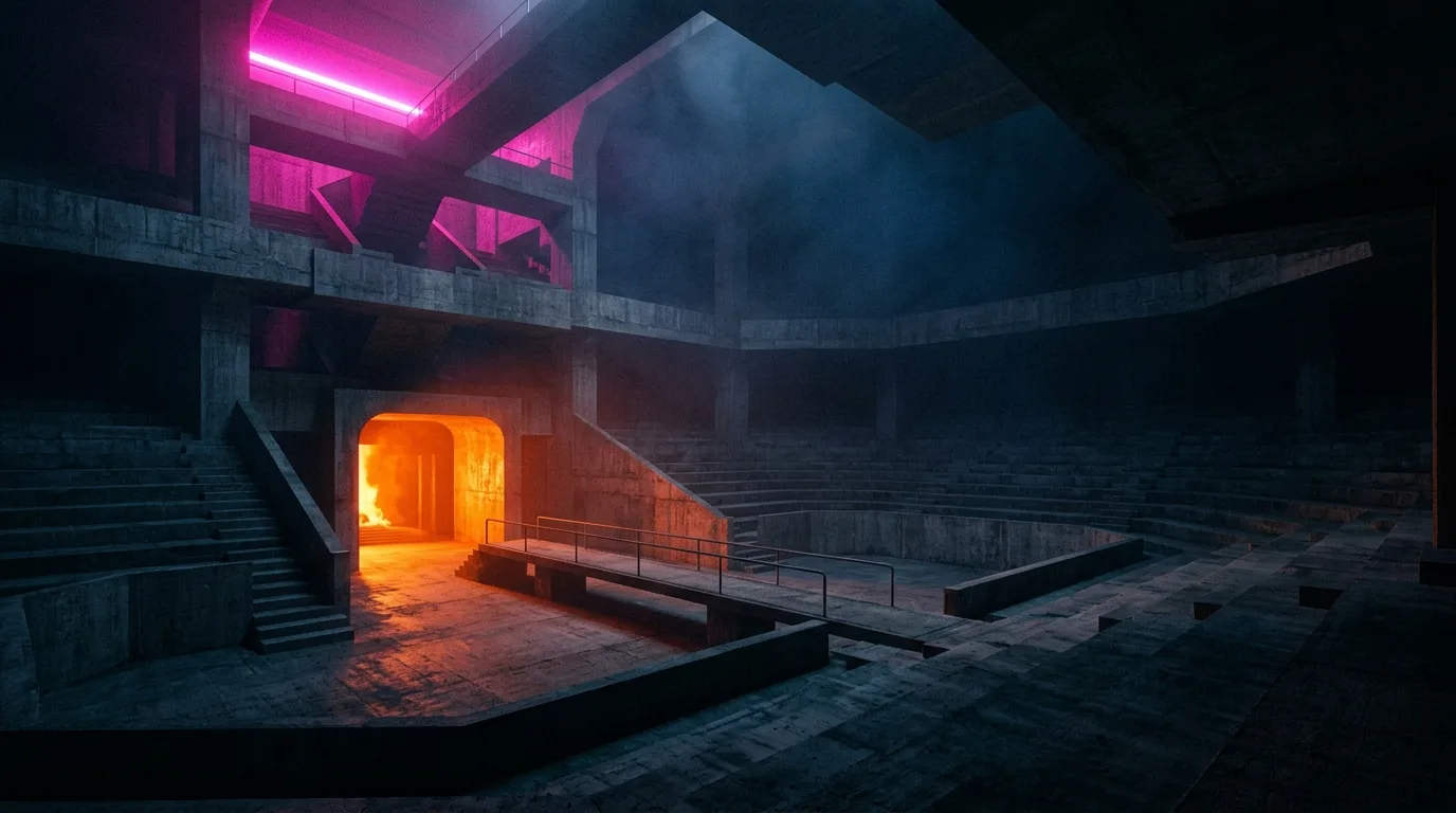
Building the hellfire palette: magenta, ember and near-black
The colour rules behind Neon Hellfire: a near-black base, one hot magenta accent for what matters, and ember orange reserved for fire and danger.
The colour rules behind Neon Hellfire: a near-black base, one hot magenta accent for what matters, and ember orange reserved for fire and danger.

Retro shooters are often remembered as brown. Neon Hellfire goes the other way: a near-black world where light is rare, so every glow means something.
Hot magenta marks what you need to read instantly: your crosshair, your health and the edges of the arena. Because it is scarce, it never gets lost.
Ember orange is saved for heat and danger. When you see it, something is burning or about to hurt you.
A tight palette also keeps the pixel art readable at speed, which matters more than detail when a demon is two tiles away.
Design · · 1 min read
How Neon Hellfire tunes its opening arena so demons close the distance fast, forcing movement over hiding and keeping every run short and intense.
Design · · 1 min read
Why Neon Hellfire sticks to WASD movement, Q/E or arrow turning, one fire button and mouse aim, plus on-screen touch keys for phones.